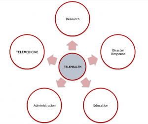
One of the things I do a lot is sit and ponder the best ways to get the word out about telehealth in the south central region. That usually leads me to think, “Am I the only person who’s interested in this stuff?” Telehealth and it’s cousin, Telemedicine, have gone from being obscure terms to being understood by more of the mainstream. Both terms are fairly descriptive so if you happen to hear someone say, “I work in telehealth,” a reasonable person can figure out the meaning. My personal understanding is that telemedicine is the older term and telehealth the newer, more preferred term since it’s more inclusive. Here’s a graphic on how the terms relate taken from our module,
You probably have heard about key words trending on Twitter. Whether it’s “twerking” or “telemedicine” there’s a pretty simple way to track the usage of key words on Twitter by using a hashtag search. You might wonder, “Is there a way to track Google search trends?”
The answer is yes! Google has a little-known way to track keyword trends (little-known to me anyway). It’s called Google Trends. Google Trends provides a graphical representation of search data.
My first search was the word “telehealth.” Here’s the result, an interactive data chart:
Here are the results of the keywords, “telehealth” and “telemedicine.”
So, according to Google, searches for the words, “telehealth” and “telemedicine” have declined. That’s to be expected as a sector matures. My next search was for a relatively new term, mHealth or mobile health. The mHealth market landscape has been growing extremely fast recently.
Here are the results for the term, “mhealth.”
Here’s a plot for the terms, “telehealth,” “telemedicine” and “mhealth.”
It would be easy to misinterpret the data since it looks as if the term mhealth isn’t popular relative to telehealth and telemedicine. Here’s another good post on how to interpret the relative data Google Trends produces. This statement is provided by Google on the subject on its Trends data, “The numbers on the graph reflect how many searches have been done for a particular term, relative to the total number of searches done on Google over time. They don’t represent absolute search volume numbers, because the data is normalized and presented on a scale from 0-100. Each point on the graph is divided by the highest point, or 100. When we don’t have enough data, 0 is shown.”
Just for fun, here’s the graph for “twerking.”


